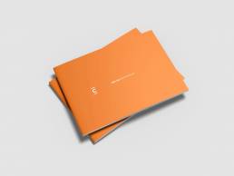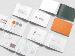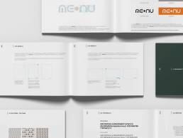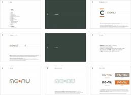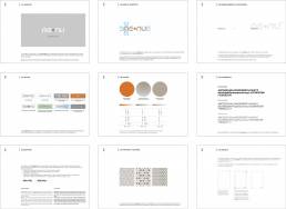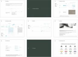
me•nu – logo styleguide
me•nu is the brand of an innovative chain of cafés located in the Copernico coworking spaces in Milan. me•mu comes from the acronym of 4 words that define its essence and philosophy: mind, energy, nature, upload.
me•nu also means functional food, a smart diet designed for those who work smart, to feed the mind and please the palate.
In cooperation with EU! Communication we have created the style guides of the logo, starting from the definition of the lettering which takes shape from the symbolism of the circle, synonymous with life, perfection and homogeneity.
ClientCopernico & Friends S.r.l.AgencyUE! comunicazioneSectorHo.Re.Ca.Servicesbrand styleguideYear2017

